England as other developed countries is ageing. Is this process going to increase, stabilise, decrease …? The Office of National Statistics regularly releases information on population trends. In this post I look at the old-age dependency ratio (OADR) which represents the people aged 65 and over for every 1,000 people aged 16 to 64 years (“traditional working age”).
The process is relatively nice and easy. It consists of three core steps:
Load the geographical data and select the information for England
Arrange the data into a tidy format
Plot the data in a faceted way
Load the data
First things first, let’s get the geographical information (aka. the shapefile) on board. Before, this was a bit messy process but this is extremely easy with sf::read_sf(). The Office of National Statistics offers geographical information at several levels for the whole United Kingdom. I am only interested in the information referred to the 326 districts in England (denominated with E0... )
england = sf::read_sf("./data/geography/england_lad_2017/Local_Authority_Districts_December_2017_Ultra_Generalised_Clipped_Boundaries_in_United_Kingdom_WGS84.shp") %>%
  filter(str_detect(lad17cd, "^E0"))
The data created is a tibble
## Simple feature collection with 5 features and 10 fields
## geometry type:  MULTIPOLYGON
## dimension:      XY
## bbox:           xmin: 418796.4 ymin: 506491 xmax: 478259.4 ymax: 537164.9
## epsg (SRID):    NA
## proj4string:    +proj=tmerc +lat_0=49 +lon_0=-2 +k=0.9996012717 +x_0=400000 +y_0=-100000 +datum=OSGB36 +units=m +no_defs
## # A tibble: 5 x 11
##   objectid lad17cd lad17nm lad17nmw  bng_e  bng_n  long   lat st_areasha
##      <dbl> <chr>   <chr>   <chr>     <dbl>  <dbl> <dbl> <dbl>      <dbl>
## 1        1 E06000… Hartle… <NA>     447157 531476 -1.27  54.7  96586817.
## 2        2 E06000… Middle… <NA>     451141 516887 -1.21  54.5  54741668.
## 3        3 E06000… Redcar… <NA>     464359 519597 -1.01  54.6 247140467.
## 4        4 E06000… Stockt… <NA>     444937 518183 -1.31  54.6 206473805.
## 5        5 E06000… Darlin… <NA>     428029 515649 -1.57  54.5 198298966.
## # … with 2 more variables: st_lengths <dbl>, geometry <MULTIPOLYGON [m]>
The second main source of information refers to the OADR. The data covers years 1996 to 20361 in periods of 10 years. The names of the variables in the information of the ONS are not particularly clean so janitor::clean_names() does a splendid job here.
ageing = read_excel("data/raw/ons_uk_ageing.xls", sheet = "Old Age Dependency Ratio" ) %>%
  clean_names() %>%
  filter(str_detect(area_code, "^E0"))
Tidy the data
The key is to present the data in long format having a time and a dependency variable for each decade and old age dependency ratio respectively. tidyr::gather() may be a good option here.
ageing = ageing %>%
  gather(year, dependency, x1996:x2036, -area_code, -area_name) %>%
  mutate(year = gsub("x", "", year)) %>%
  arrange(area_code, year)
## # A tibble: 5 x 4
## area_code area_name year dependency
## <chr> <chr> <chr> <dbl>
## 1 E06000001 Hartlepool 1996 244.
## 2 E06000001 Hartlepool 2006 261.
## 3 E06000001 Hartlepool 2016 303.
## 4 E06000001 Hartlepool 2026 384.
## 5 E06000001 Hartlepool 2036 480.Also, to fill the map I convert the OADR into a factor variable with dplyr::ntile() and link it to the data frame with geographical data (england). I create a variable lab_dep with the max and min value of each tile and that I will use as label for the represented variable.
ageing = ageing %>%
  mutate(quintile_dep = ntile(dependency, 7),
         lab_dep = as.factor(ordered(case_when(quintile_dep == 1 ~ "[81 - 218)",
                                               quintile_dep == 2 ~ "[218 - 250)",
                                               quintile_dep == 3 ~ "[250 - 283)",
                                               quintile_dep == 4 ~ "[283 - 329)",
                                               quintile_dep == 5 ~ "[329 - 392)",
                                               quintile_dep == 6 ~ "[392 - 478)",
                                               quintile_dep == 7 ~ "[478 - 928)"))))


england_ext = full_join(england, ageing, by = c("lad17cd" = "area_code", "lad17nm" ="area_name") )

england_ext$quintile_dep = as.factor(england_ext$quintile_dep)
## Observations: 1,630
## Variables: 15
## $ objectid <dbl> 1, 1, 1, 1, 1, 2, 2, 2, 2, 2, 3, 3, 3, 3, 3, 4, 4, …
## $ lad17cd <chr> "E06000001", "E06000001", "E06000001", "E06000001",…
## $ lad17nm <chr> "Hartlepool", "Hartlepool", "Hartlepool", "Hartlepo…
## $ lad17nmw <chr> NA, NA, NA, NA, NA, NA, NA, NA, NA, NA, NA, NA, NA,…
## $ bng_e <dbl> 447157, 447157, 447157, 447157, 447157, 451141, 451…
## $ bng_n <dbl> 531476, 531476, 531476, 531476, 531476, 516887, 516…
## $ long <dbl> -1.27023, -1.27023, -1.27023, -1.27023, -1.27023, -…
## $ lat <dbl> 54.67616, 54.67616, 54.67616, 54.67616, 54.67616, 5…
## $ st_areasha <dbl> 96586817, 96586817, 96586817, 96586817, 96586817, 5…
## $ st_lengths <dbl> 50245.93, 50245.93, 50245.93, 50245.93, 50245.93, 3…
## $ year <chr> "1996", "2006", "2016", "2026", "2036", "1996", "20…
## $ dependency <dbl> 244.1609, 261.2594, 303.0965, 384.3626, 479.5169, 2…
## $ quintile_dep <fct> 2, 3, 4, 5, 7, 2, 2, 2, 4, 5, 3, 3, 5, 6, 7, 2, 2, …
## $ lab_dep <ord> [218 - 250), [250 - 283), [283 - 329), [329 - 392),…
## $ geometry <MULTIPOLYGON [m]> MULTIPOLYGON (((448801.4 53..., MULTIP…Plot the data
Let´s begin plotting the OADR for 2016. sf::geom_sf() seems to be a simpler solution to other alternatives such as ggplot:geom_polygon().
 england_ext %>%
  filter(year == "2016") %>%
  mutate(lab_dep = gsub("[[:alpha:]]", "", lab_dep)) %>%
  rename(OADR = quintile_dep) %>%
  ggplot(aes(x = long, y = lat, fill = OADR)) +
  geom_sf(colour = alpha("grey", 1 /3), size = 0.2) +
  coord_sf( datum = NA) +
  scale_fill_viridis(option = "viridis",
                     labels = c("[81 - 218)", "[218 - 250)", "[250 - 283)", "[283 - 329)", "[329 - 392)", "[392 - 478)","[478 - 928)"),
                     alpha = 0.85,
                     discrete = T,
                     direction = -1)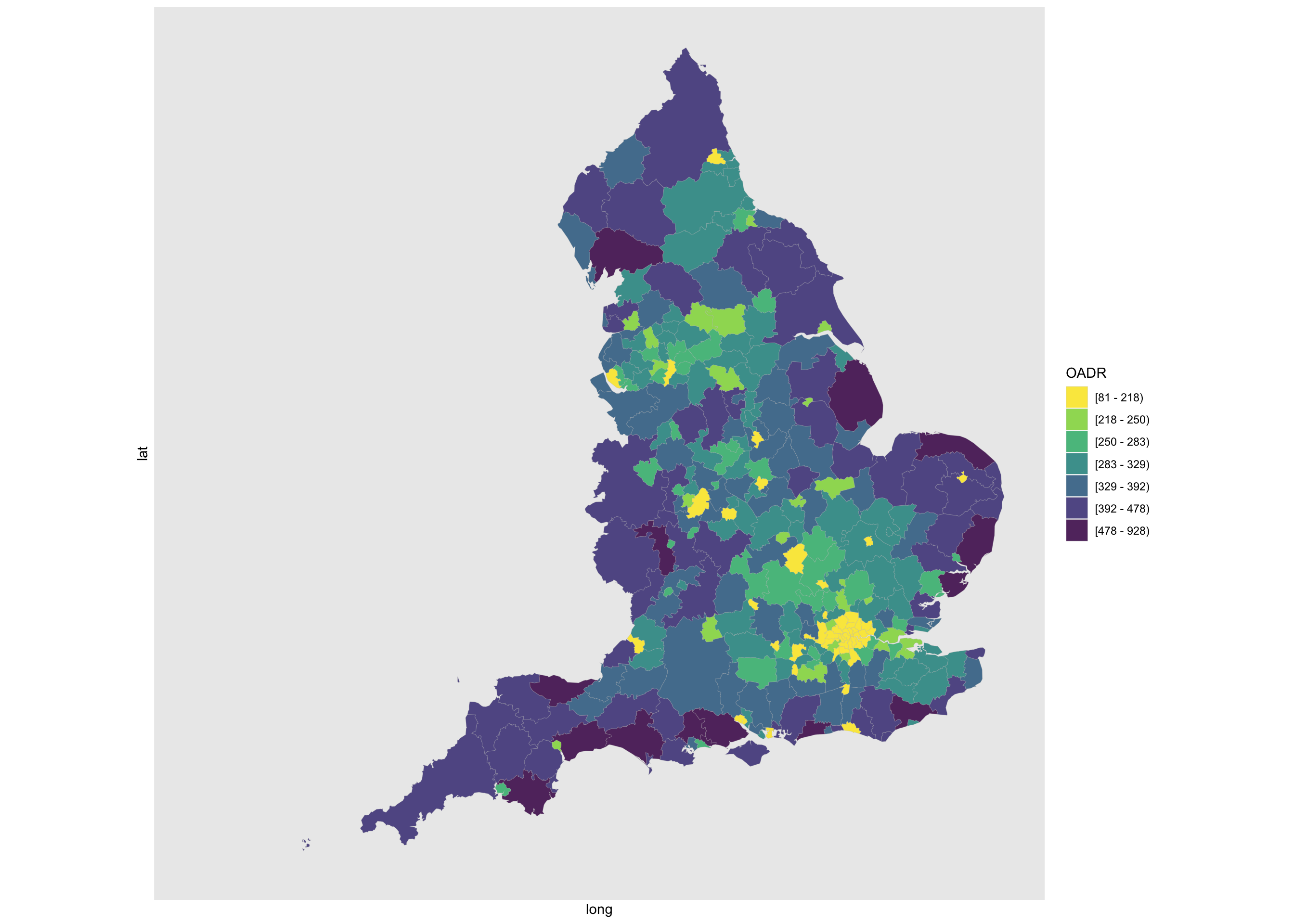
Not too bad. Yet, what is the picture over time?.
plot_ageing = england_ext %>%
  mutate(lab_dep = gsub("[[:alpha:]]", "", lab_dep)) %>%
  rename(OADR = quintile_dep) %>%
  ggplot(., aes(x = long, y = lat, fill = OADR)) +
  geom_sf(colour = alpha("grey", 1 /3), size = 0.2) +
  coord_sf( datum = NA) +
  scale_fill_viridis(option = "viridis",
                     labels = c("[81 - 218)", "[218 - 250)", "[250 - 283)", "[283 - 329)", "[329 - 392)", "[392 - 478)","[478 - 928)"),
                     alpha = 0.85,
                     discrete = T,
                     direction = -1,
                     guide = guide_legend(
                       direction = "horizontal",
                       title.position = "top",
                       title.hjust =0.5)) +
  facet_wrap(~ year, ncol = 3)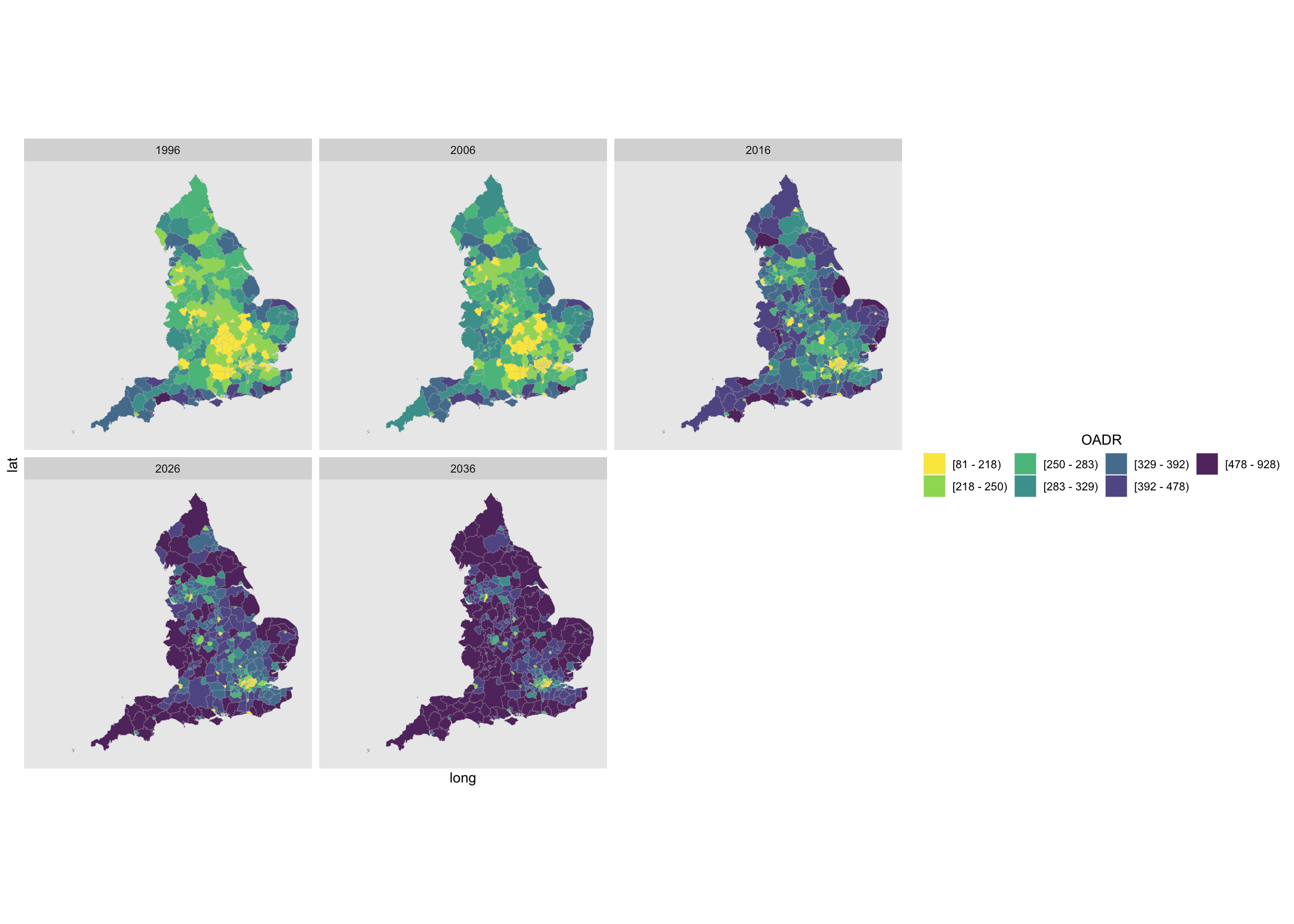
The key line is the facet_wrap() call which allows to facet OADR over years. A bit of fine tunning with some options in theme() give a cleaner plot.
plot_ageing +
  theme(axis.text = element_blank()
        ,axis.title = element_blank()
        ,axis.ticks = element_blank()
        ,axis.line=element_blank()
        ,panel.grid = element_blank()
        ,legend.text = element_text(size = 10)
        ,legend.key.width = unit(0.35,"cm")
        ,legend.key.height = unit(0.35,"cm")
        ,plot.title = element_text(size= 6)
        ,legend.position = "bottom"
        ,plot.caption = element_text()
        ,legend.background = element_blank()
        ,panel.background = element_blank()
        ,legend.spacing.x = unit(0.25, 'cm')
,strip.text.x = element_text(size = 12)) 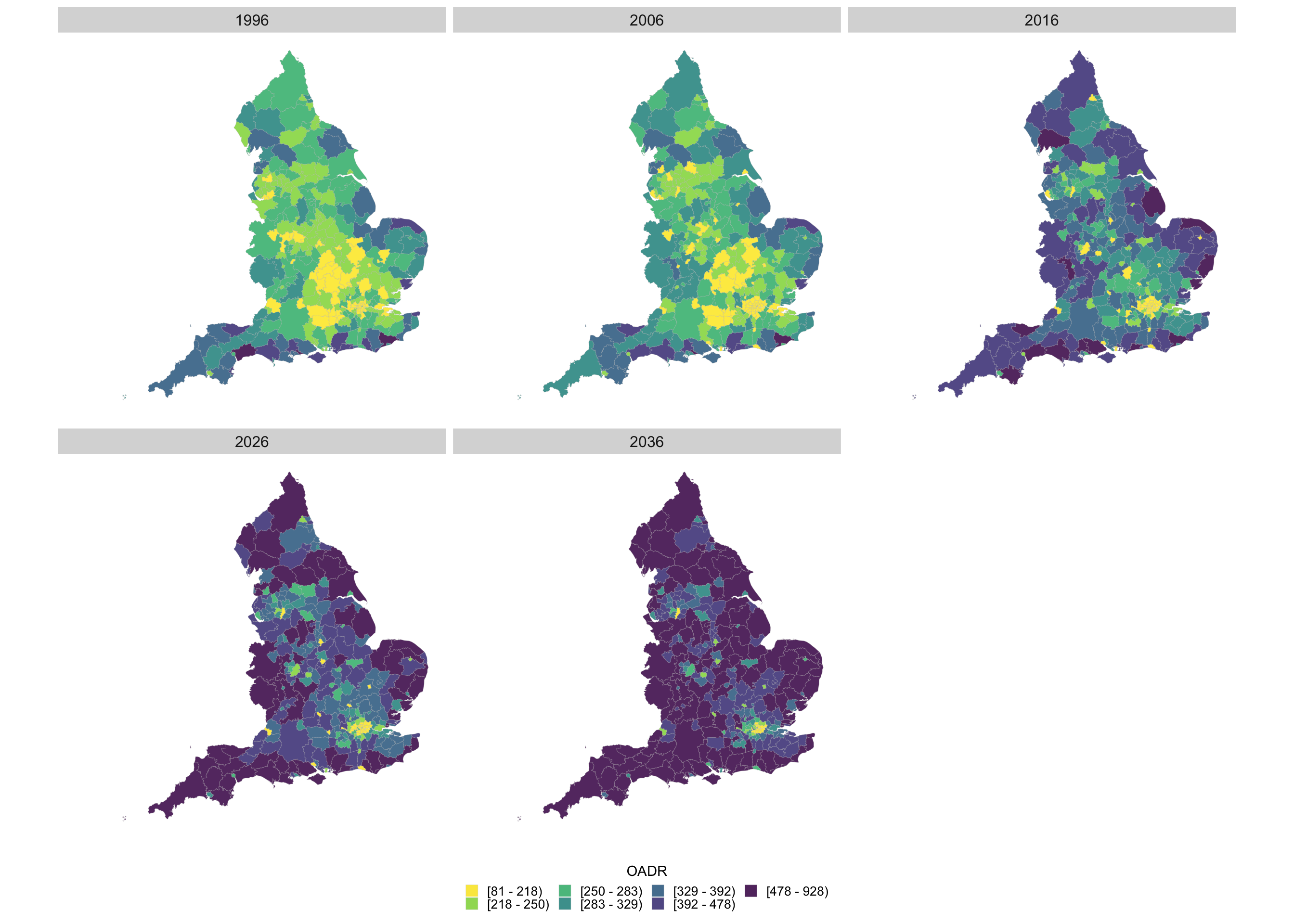
Animate the plot
We can combine the former plots by creating an animated map with gganimate::animate(). Here the main difference with respect to a simple plot in ggplot() is the incorporation of transition_manual() that specifies the transition in the map.
aniplot = england_ext %>%
  mutate(lab_dep = gsub("[[:alpha:]]", "", lab_dep)) %>%
  rename(OADR = quintile_dep) %>%
  ggplot(., aes(x = long, y = lat, fill = OADR)) +
  geom_sf(colour = alpha("grey", 1 /3), size = 0.2) +
  coord_sf( datum = NA) +
  labs(title = "Old Age Dependency Ratio (OADR)",
       subtitle = 'Year: {current_frame}') +
  transition_manual(year) +
  scale_fill_viridis(option = "viridis",
                     labels = c("[81 - 218)", "[218 - 250)", "[250 - 283)", "[283 - 329)", "[329 - 392)", "[392 - 478)","[478 - 928)"),
                     alpha = 0.85,
                     discrete = T,
                     direction = -1,
                     guide = guide_legend(
                       direction = "horizontal",
                       title.position = "top",
                       title.hjust =0.5)) +
  theme(axis.text = element_blank()
        ,axis.title = element_blank()
        ,axis.ticks = element_blank()
        ,axis.line=element_blank()
        ,panel.grid = element_blank()
        ,legend.title = element_blank()
        ,legend.text = element_text(size = 14)
        ,legend.key.width = unit(0.35,"cm")
        ,legend.key.height = unit(0.5,"cm")
        ,plot.title = element_text(size= 22)
        ,plot.subtitle=element_text(size=18)
        ,legend.position = "bottom"
        ,plot.caption = element_text()
        ,legend.background = element_blank()
        ,panel.background = element_blank()
        ,legend.spacing.x = unit(0.25, 'cm'))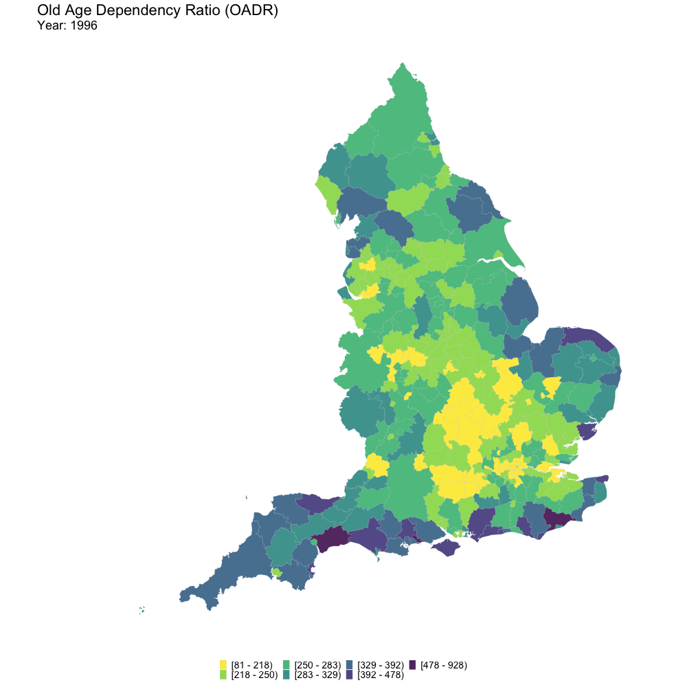
The code and data to reproduce the figures are available on Github.
Data for 2026 and 2036 are projections↩